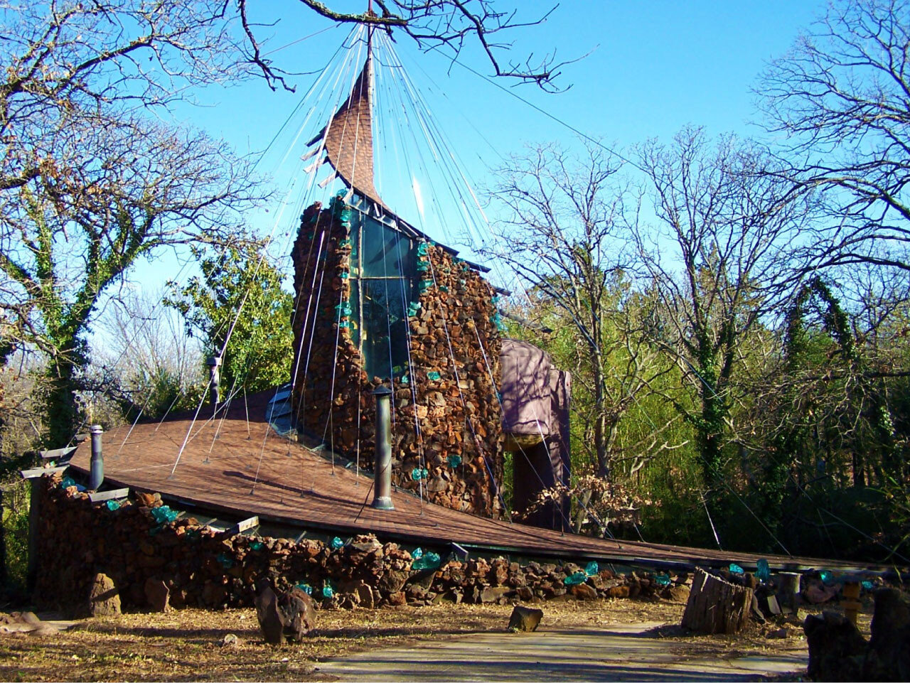
Harnessing AI to Visualize Architectural Dreams

Introduction: The advent of AI in architecture has revolutionized how we conceptualize and visualize our ideas. Tools like ChatGPT, equipped with image generation capabilities, now enable architects to transform written words into visual depictions. This blog post explores the art of crafting writing prompts that ChatGPT can use to create compelling architectural images, helping professionals and enthusiasts alike bring their blueprints to life.

  1. Understand the Capabilities and Limitations Begin by familiarizing yourself with the AI’s capabilities. ChatGPT can generate detailed images from descriptive text, but its success largely depends on the clarity and specificity of the input. Understanding the AI's scope, including its style parameters and interpretation abilities, is crucial for creating effective prompts.

  2. Be Specific and Detailed Precision is key when composing prompts. For architectural visualization, detail every element you want to include in your scene, such as the style (e.g., Brutalist, Modernist), key features (like balconies, facades, landscaping), and the atmosphere or mood (sunset, bustling city). The more specific you are, the closer the generated image will be to your vision.

  3. Incorporate Context Contextualize the structure within its environment. Describe the surrounding area—whether it’s an urban street, a tranquil countryside, or a beachfront. Mentioning adjacent elements like parks, vehicles, or pedestrians can enhance the realism and scale of the architectural design in the AI-generated image.

  4. Use Visual References While direct uploads of reference images might not always be an option, describing notable architectural landmarks or famous designs can guide the AI towards the aesthetic you’re aiming for. For example, prompting with "Imagine a building as streamlined as the Guggenheim Museum in Bilbao" can help steer the visual output.

  5. Iterate and Refine The process of perfecting AI-generated images often involves iteration. Based on the initial output, refine your prompt to adjust elements that are off-target or enhance details that are lacking. This iterative process can significantly improve the accuracy and quality of the visualizations.

Rappel A'Ordre

The article, Rappel A L'Ordre, The Case for the Tectonic by Kenneth Frampton explains to the reader the modern view of the word tectonics. He exemplifies how the idea of tectonics is used both in construction technology and throughout the design process. Tectonics is both directly shown in construction details and the overall composition of the design. He also disagrees with Robert Venturi's idea of a decorated shed. Later he spoke on the subject on cubism in the 20th century; the ideas explore an intro into man's spiritual gravity. Tectonics is a way design can be reflected in a tactile physical environment, to express a center of gravity to the commodity of shelter. Declaring tectonics should be stylistic, not seeking factual evidence in science, literature, or art. Identifying the tectonic poetry and construction of the building can be reflected by materiality, structure, and natural light. Tectonics can be treated as a bridge between conceptualization and realization. He is Taking an original idea as thought, creating in an environment that one can touch and feel. Tectonics is both caused and impacted by three conditions: technological object, stenographic object, and tectonic
object. Reconnecting architecture to the visual arts creates an embodiment of culture, philosophy, and art. I appreciated this article because of its recognition of what goes unsaid in architecture. Instead of trying to support all design
principles by factual evidence, there is also another factor of design that is displayed by one's center of gravity. I believe this ideal is what shapes the human experience and interaction with architecture. The expression of
architecture can be experienced through a point of view and also from a two-dimensional drawing explaining the tectonic details of connections.

https://www.pinterest.com/pin/569353577878742565/

https://www.pinterest.com/pin/569353577878742565/

http://idaaf.com/peter-zumthors-tourist-facilities-zinc-mines/

http://idaaf.com/peter-zumthors-tourist-facilities-zinc-mines/


Architecture, Nature, and the Constructed Site

Tadao Ando has become an influential architect many different times throughout my architectural journey. Visiting the Museum of Modern Art in Fort Worth was an enlightening experience. Reading about architecture and looking at pictures is an excellent research tool, but there is nothing that can come close to genuinely experiencing the building through your own life’s perspective. Ando’s work comes off as simple to the arrive viewer, but shows the complexity of simplicity to the more curious. Diving into his teachings, you get an understanding of how he solves problems of the balance of nature and place in his architectural designs. His designs are thought to provoke, pushing the modern architectural agenda. When looking at my designs throughout architecture school, my designs might be seen as complex with an exploration in form rather than a simplistic solution to a complex problem. Even being a keen follower of the deconstructivism movement of Frank Gehry and Daniel Libeskind, I still find myself time and time again falling in love with Tadao Ando’s teachings. Tadao has earned the term starchitect and master builder as he merges structures with the natural landscape to create once in a lifetime experiences. The complete balance of life incorporated in architectural design is a goal all architects strive for. Culturally Japan has been deep-rooted in the idea of human life is intertwined with nature. Featuring the ideology of humans is nature, by fact, not disconnected in the modern-day metropolis. Place defines the architectural solutions driven by the location. Whether cultural, natural, or climate. Tadao Ando has contributed more than enough to the future of architecture around the globe.

Photo taken by John Zogg

Photo taken by John Zogg

Photo taken by John Zogg

Photo taken by John Zogg


The Death and Life of Great American Cities

Jane Jacobs was an American-Canadian journalist and activist addressing a wide range of topics, including architecture, economics, and sociology. Her most famous text id “The Death and Life of Great American Cities.” Jacob’s writing style is engaging because she doesn’t write like an architect or even an activist for that matter, but she explains her life experience. She speaks about actual urban context, not just assuming there will be human interaction, but truly understanding and teaching that interaction in human terms. She uses many descriptive phrases making a unique read, making the reader decipher and create their meaning. While still being a respected activist in multiple communities, she doesn’t attack the city itself but relates to a middle class “normal” American citizen. I find this beneficial because she helps you understand her side through her eyes, slowly guiding the readers thought along a loose rope. Criticism for her writing style is that it can sometimes be hard to interpret for the reader because of a fault in connection to specific phrases. This can be caused by many different qualities of demographics, including age, intelligence, and even culture itself. Although exciting and guiding to the reader, the writing style can be hard to follow. Over years of experience, Jane Jacobs has formulated the layout of prosperous American cities and the principles that destroy and create great American cities. She doesn’t attack style; she demonstrates the negatives of the principles taught across America. She gives a refreshing new outlook on cities, because of her experience outside the world of architecture. She was never taught the Orthodox approach of urban planning, further stopping her limitation of ideals.


Landscape is More Than a Lawn

“Landscape is more than a lawn” is a chapter written on the article/ speech coined “Public Parks and the Enlargement of Towns” written by Frederick Law Olmsted. Frederick Law Olmsted was an American landscape architect in the 19th century. He is known to be the “father of American landscape architecture” he was known for designing multiple famous urban parks, including central park. The article relates to “modern” science, modern science meaning modern in the 19th century, explaining the “evil” of modern cities. He portrays the unhealthy habits of large cityscapes without urban greenery. His writing style throughout the article is Shakespearian using multiple accounts of personification and larger metaphors. He criticizes the current urban fabric, for the population increases without foliage creation. Also pushing the idea of not planting trees in the act of wrongdoing. He determines that no space has been created for foliage, but actually on the contrary, as trees are pushed and shoved from which areas they belong. Claiming the expense of trees is high compared to the pavement but raises the worth of real estate and experience of the urban fabric. Olmsted writes this piece with an activist mindset with a formal theoretical approach. He almost creates his very own manifesto with a call to action tone of speech. One thing left out in his speech is the impact of the natural landscape, but he speaks more on the human design and creation of foliage and sunlight. Personally, I find this detrimental to his argument because he doesn’t explain how little of central park isn’t planned or planted rather placed and created. I believe there is a large amount of wasted natural potential untapped in large cities. He speaks about making space for beautiful trees, but barely scratches the surface on building modern cities around the unused natural landscape. I believe the parks are the lungs of modern cities, but they should not just be a simple zone on a map but truly integrated into the urban fabric itself.


Bruce Goff Exhibition

The Renegades exhibit at the Fred Jones is a new temporary exhibit that debuted late last week. The initial expression it gives to the viewer is almost a shoulder shrug, not further guiding, but feels as if the cardboard walls have turned its back on you. The exhibit contains the work of the American School of Architecture. Bruce Goff being the dean at the time, exemplifies abstract forms in relation to schools of a similar time period. The exhibit offers exquisite drawings and models explaining the design process of the American School. The exhibit itself is a whole different story. It starts with a comparison of the American school to other schools around the country. Later is shaping the circulation as one circulates through the room. The circulation is formed by a fractal in the center of the exhibit. The fractal portrays the different ideas of Bruce Goff’s Bavinger house, making the user dizzy and uneasy. The models are placed in the middle, offering no reference to drawings or design principles. The models themselves are in their own existence are a work of art, while being placed poorly with no relation to the exhibit. The fractal has displayed the demolished products showing the different replacements for the structures built by the American school. The materials used in the exhibit help to understand the Goff method of design by using recycled materials to generate expressive forms. The materials and expressive forms don’t create something that takes away from the amazing work at hand, Possibly being the purpose behind the experiential qualities of the room. The exhibition is likely to have a high approval due to the fascination of Bruce Goff’s work inspiring businessmen, all the way to artists across the Norman campus. The first impression of the exhibit is often the most important and allows the viewer an opportunity to judge the room at first glance. The exhibit does a poor job of creating a strong entry sequence, often causing dissatisfaction in the user.

Searching for a Center

Chapter 4 was interesting because of the unique writing style of Moore. He speaks as if the reader is having a conversation, sparking comments in the reader’s head. He writes as  if he is taking you on a ride along through the streets of L.A. while giving you a synopsis of the city, almost as if the In-n-out line is backed threw the parking lot and he is waiting for a great burger. The last part of the sentence just written is an example of how Moore relates to the reader by using common branding tactics. He uses Disneyland to relate to the people and emphasizes the act of social interaction caused by well designed public spaces. The problem is that Disneyland is a pay to enter type “public space” and is only truly experienced by the people willing to pay for the ticket. The writing style entices the reader, and instead of creating an agreement or disagreement, he creates a sort of middle ground between writer and reader, making them neither friend or foe. Moore’s writings differ far from Davis’s, while Moore’s friendly, Davis is highly critical and direct with his critiquing style. This style is easy to follow and is more formal. That being said, when Davis makes a direct critique, the reader tends to agree strongly or disagree strongly. The greyish center part is completely negated. With that being said, the reader and writer could connect through strongly opinionated statements and keeps the reader engaged. Moore also gives a great amount of power to the people in the creation of monuments, understanding that people create cities, not just architects. Both Davis and Moore critique the small amounts of urban public space, where people gather for a number of social interactions. Both writers explain that the monument of Los Angeles is not Hollywood or Beverly Hills; it is the Highway. Where do people truly experience the city from? On their drive into work every day. This is a simple concept missed by many modern-day architects and designers. Both of these writers are highly skilled in their preferred writing style, personally, I loved both articles, and I found that it was interesting how I reacted to both while reading. While Moore creates a friendship with his reader, Davis keeps it honest and straight to the point. Both creating polarized writing style.

Walt Disney Concert Hall, Frank Gehryhttps://www.google.com/search?q=Disney+Concert+Hall

Walt Disney Concert Hall, Frank Gehry

https://www.google.com/search?q=Disney+Concert+Hall

Disneyland, Anaheimhttps://www.google.com/search?